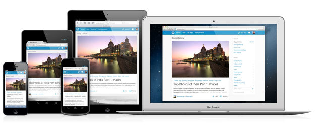
What is Responsive Design?
Responsive web design is a method for designing a single web site that dynamically adapts to fit the screen of the viewing device. The primary motivation is to make reading and navigation easier for tablet and mobile phone users. This is typically accomplished with fluid grids, scalable images and CSS media queries although other methods exist.
The Problem
For as long as I can remember, and I've been in this business since 1998, ads have always been designed at a fixed size. Back then the 468x60 banner was king. Then computer screens got larger and larger, so naturally larger sizes like 728x90 and 970x90 were adopted. Then the mobile revolution happened and a funny thing happened -- screens got smaller! So, it's simple right? We can just scale down our 728x90 or 970x90 ads to 320x50 on mobile phones and that solves it. Yeah, that might work if you don't care about being able to read the text on your banners. The scalable images approach works fine for photos or illustrations, but it fails miserably when applied to any graphic that contain rasterized text.
The Solution
The best solutions are always the simplest ones. Back in March we introduced support for Responsive Ad Zones and we definitely nailed the simple part right on the head. Here's how it works. We know that 970x90 works good for computers, 728x90 works good for tablets and 320x50 works good for phones. These are IAB standard sizes so most advertisers are already producing creatives in these sizes.
We looked at this problem and said, you know what, why don't we just make the ad server detect the device type and serve an alternate ad zone that's appropriately sized for the device. So, that's what we did. You can now configure your 970x90 zone to substitute a 728x90 zone in its place for tablets and a 320x50 zone for mobile phones.
The best part about this solution is that the magic happens on the ad server, so you don't even need to change the zone coding on your web site to accomplish this!
Live Example
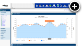
Here's an example responsive ad zone. Space is limited on this blog, so I'm going to use some different sizes for this example. On any type of computer you will see a 550x480 banner. Tablet users will instead see a 336x280 banner and mobile phone users will see a 320x50 banner.
Note that if you have a User-Agent switching plugin installed in your browser you can use that to test the responsiveness of the above banner since we detect the device type based on it.
Making a Zone Responsive
I'm going to assume that you already have 970x90, 728x90 and 320x50 zones set up and filled with some campaigns. The 970x90 will be shown to computer users, the 728x90 to tablet users and the 320x50 to mobile phone users. In fact, it's good if you already have the 970x90 zone coded into your page since that will be required.
- Go to Zones and edit your 970x90 banner zone.
- Scroll down and click on Zone Substitution.
- Select your 728x90 banner zone for Tablets
- Select your 320x50 banner zone for Mobile Phones
- Press the Save Changes button
At this point you'll need to code the 970x90 banner zone into your page if it's not already. The other zones are not coded into your page. We take care of the zone substitution on the ad server, so it happens automatically.
Hiding Zones
Sometimes you don't want a zone that appears on the desktop version of your site to appear on your mobile site. This must be done very carefully. Simply adding CSS to hide the zone is not a good approach because the ad content may still load and count impressions when in reality the visitor did not see the ads! The better approach is to configure the zone to hide itself for tablets and/or mobile devices, which completely stops the zone from being served on those devices. For help with that, we have now written a follow-up article showing how to do that.
Final Thoughts
This article focused on banners, but this same approach can be applied to many types of ads. Crawlers, lightboxes, overlays and text ads can all be made responsive. As a rule of thumb, don't exceed a creative width of 970 pixels for computers, 728 pixels for tablets or 320 pixels for mobile phones and whenever possible try to stick to the IAB standard sizes (your advertisers will appreciate it).
 Mike Cherichetti